Dark Washroom Colours

Colour Conundrum: Selecting The Right Palette For Washroom

| Washrooms & Beyond

Share

Colour Conundrum: Selecting The Right Palette For Washroom

Considering that the colour can deeply impact the client’s day to day life and have an impact on moods, emotions and state of mind, designers give a lot of attention to detail when choosing the colour scheme.

In search of the perfect design Dutch Designer, Merel Bekking conducted an experiment using an MRI scanner to detect preferences in the brain. She monitored variables such as material, colour, texture, and shape. She found that the brain reacted the best to red, plastic, and closed organic shapes.

This is not to suggest that these are universal and hence should be the most preferred choice, but it hints at the fact that colours and texture and such variables of designing indeed have a psychological effect on our day to day life. Colour is a powerful communication tool which can be used to signal action, influence mood, and cause physiological reactions. Certain colours have been associated with increased blood pressure, increased metabolism, and eyestrain. In fact, colour is used to heal various illnesses in Chromotherapy.

Washroom colours and designs
Striking the right balance to create that wow factor for the bathroom. Photo Courtesy: And Design Co

How colour impacts moods?

The colours of the rooms bring out the personality of the homeowner. Colours affect people in many ways, depending upon one’s age, gender, ethnic background or local climate. However, it is important to note here that an individual’s feelings or reaction to a particular colour are often personal, deeply rooted in their own experience or culture.

For example, while the colour white is used in many Western countries to represent purity and innocence, it is seen as a symbol of mourning in many Eastern countries. This is one big hurdle when it comes to widespread adoption of a particular trend or getting to a point to decide the optimal mix of colours. Therefore, it remains customised to the preference of the clients.

However, the good news is that certain colours or groups of colours tend to get a similar reaction from most people – the overall difference being in the shade or tones used. The warm colours which include red, orange and yellow evoke emotions ranging from feelings of warmth and comfort to feelings of anger and hostility. On the other side, cool colours which include blue, purple and green, are often described as calm, but can also call to mind feelings of sadness or indifference.

Lalita Tharani

Lalita Tharani

Principal Architect, Collaborative Architecture

“The one factor that impacts the colour choices is the cost, specifically in the case of designing bathrooms for apartment buildings. It will be surprising to know that the cheapest of the glazes are in the brown and beige spectrum and to have a wider choice of colour, one would need to select from imported tiles.” 

Selecting colour palette for the washroom

Bathroom colour schemes are essential for getting the look, feel and design just right for the bath or shower room. Creating the right ambience is key for a bathroom especially, because we use it every day. It’s the place that at times we need to feel completely indulgent – run a bath and shut the world out kind of vibes.

Shamini Shanker Jain, Principal Architect, SS+PD Architects feels that the residential bathrooms are the most challenging, and recognising the fact that there are so many personalities and preferences involved, it becomes a veritable box of innovation.

And, rightly so, as the client’s lifestyle and personality need to be reflected in the colour scheme selected for the washroom. “A bathroom is about freshness; about colour palettes that work with a user’s personality.  My colour palette largely works with bright bold hues against soft backgrounds with the idea that one never tires of the setting over time. Being aware of good maintenance one avoids colours that are dreary and dull,” adds Shamini.

Nimeran Singh

Nimeran Singh

Associate Architect, Ashwin Alva Associates

“In our experience, more than colour, it’s various patterns and textures that are becoming popular like terrazzo and quartz. Our clients usually like bright and fresh colour schemes that won’t look dated in a couple of years.” 

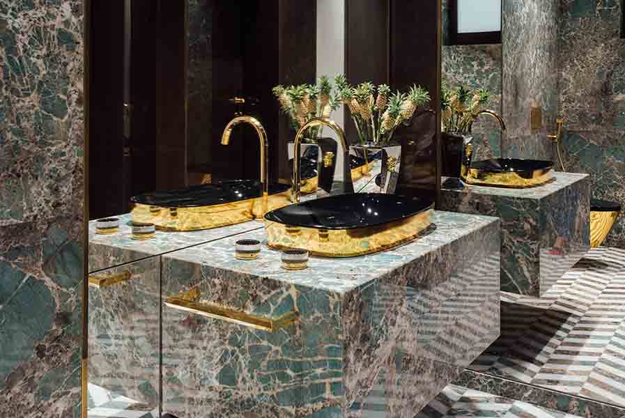
To inject a touch of personality, designers often break free of staid and rather safe designs, opting to add pops of colour. For example, adding a bright hue to the bathroom really lifts the aesthetic quotient, bringing this functional space into line with the rest of the home decor.

Lalita Tharani, Principal Architect, Collaborative Architecture says, “The one factor that impacts the colour choices is the cost, specifically in the case of designing bathrooms for apartment buildings. It will be surprising to know that the cheapest of the glazes are in the brown and beige spectrum and to have a wider choice of colour, one would need to select from imported tiles.”

Rupesh Baid, Principal Architect, And Design Co says, “The scheme of the washroom depends on various aspects. If it’s an en-suite, I would prefer to go with a scheme following the room decor. If it’s a powder room, then depending on the style, I would experiment with colours because it has its independent identity.”

When choosing a colour scheme, it’s also important to keep the style of the space in mind. Is the bathroom sleek and modern with a clean-lined tub and vanity, or is it a traditional space with mouldings and more ornate features? This has bearing on the selection of the colour palette. For example, the streamlined architecture of a modern bathroom pair well with crisp whites, pretty pastels, and bright bold hues, as opposed to more muted tones.

Contrasting washroom colours
Bathroom colour schemes are essential for getting the look, feel and design just right for the bath or shower room. Photo Courtesy: And Design Co

The size of the washroom is also taken into consideration when deciding on the colour scheme. Light colours can help reflect light, making them a great choice for small or windowless spaces. Or the designer can embrace the darkness or lack of square footage with a rich, moody hue. “Another thing that’s a deciding factor is the size of the washroom and the natural ventilation. With smaller washrooms, which also may be poorly lit, I would rather go with a lighter palette for the overall and maybe a highlighter with mosaic or a wallpaper,” adds Rupesh.

Often the colour scheme for the washroom is selected keeping in mind the overall colour scheme of the project and the adjacent spaces. “I prefer it to be in line with the rest of the decor. But to add a bright hue to a children’s bath, I may add a pop of colour (depending on the age). Probably, some brooding dark shades of marble, tiles or wallpaper to bring in that little drama to a powder room. And, more so a monotone neutral mood board to achieve a classic elegant master bath,” opines Rupesh.

However, sometimes adding contrasting colours adds a bit of drama and lifts the ambience of the space. “I generally work with connected feelings – the yin and yang. This implies that I don’t necessarily match the interiors of adjoining spaces with the bathroom colours. Instead, I choose contrasts that complement each other. The drama is in the details,” quips Shamini.

Rupesh Baid

Rupesh Baid

Principal Architect, And Design Co

“The scheme of the washroom depends on various aspects. If it’s an en-suite, I would prefer to go with a scheme following the room decor. If it’s a powder room, then depending on the style, I would experiment with colours because it has its independent identity.” 

Glitzy or Subtle?

Some prefer their washroom to be glitzy while others like it to be subtle, clean and simple. For a chic and modern take on interiors, muted greys complement the otherwise neutral bathroom colour scheme. The keenness of the homeowners to bring nature inside the bathroom also affects the colour palette and the material selection to a large extent.

Elaborating on the preferences of the Indian users, Shamini opines, “I think glitzy or not, that would depend upon the aspirations of the user. Today, there is no difference between Indian and Western trends. The preference these days is for the natural stone and concrete finishes, most often administering the monolithic feel. Smokey greys and stone browns seem to be the much-preferred use of colours, however, I like to team the white element and a splash of bold colour wherever possible.”

Subtle washroom colours
The style of the fittings and their finishes add quite a bit of spunk along with the choice of tiles. Photo Courtesy: And Design Co

Rupesh adds, “I don’t believe in trends and what excites me is when I’m able to strike the right balance to create that wow factor for the bathroom without following any norms. The colour palette depends completely on the style of every individual bathroom.”

Lalita adds, “Our projects consciously don’t respond to any fashionable trends. The design and colour depending on the programme, lifestyle and the size of the given space, in this case, the bathrooms. Of course, the design becomes more flexible if it is a farmhouse or a holiday home.”

Talking about the current trends in terms of colours and materials, Nimeran Singh, Associate Architect, Ashwin Alva Associates says, “Indian clients like to be able to wash their bathrooms! They also like hardier materials and are a little reluctant to get out of their comfort zone. Post-Covid, materials now need to be even more germ repellent as well as easily sanitize-able. In our experience, more than colour, it’s various patterns and textures that are becoming popular like terrazzo and quartz. Our clients usually like bright and fresh colour schemes that won’t look dated in a couple of years.”

Shamini Shanker Jain

Principal Architect, SS+PD Architects

“A bathroom is about freshness; about colour palettes that work with a user’s personality.  My colour palette largely works with bright bold hues against soft backgrounds with the idea that one never tires of the setting over time. Being aware of good maintenance one avoids colours that are dreary and dull.” 

Sanitary and bath wares getting colourful

While the Use of photographs, and motifs certainly adds a bit of drama, now even the Wcs, basins, bathtubs and other bathroom fittings, and accessories are coming in multiple colour options. This is a trend that was highlighted in ISH last year. In fact, the theme of the ‘Pop up my bathroom’ trend forum was colour.

A number of exhibitors showcased products highlighting this trend. Gesa Hansen’s His & Hers collection for Villeroy & Boch uses bright colours to create individual flair and play with the concept of what might be considered typically male or female style. Dornbracht presented taps in pastel pink and mint green, while Italian manufacturers like Fir Italia and APM opted for gold and matt black. Alongside eye-catching fittings in bright on-trend colours and elegant matt metallics such as copper and rose gold, walls and tiles are increasingly taking on a more colourful appearance too.

Rupesh says, “With sanitaryware and fittings being introduced in different colours, it’s interesting to create theme-based washrooms for a space with artistic sensibility whether it’s modern or transitional. Recently, I used a black and gold Basin & WC to highlight the bathroom and make it look inherently rich.”

“The colours of the rooms bring out the personality of the homeowner. Colours affect people in many ways, depending upon one’s age, gender, ethnic background or local climate. However, it is important to note here that an individual’s feelings or reaction to a particular colour are often personal, deeply rooted in their own experience or culture.”

Nimeran Adds, “We have started using different finishes for bathroom fittings like faucets etc which are almost exclusively as opposed to chrome. As far as coloured fixtures like WCs and basins are concerned, we stick to earthier pastels like the ones offered by Cielo.”

However, not everyone is in awe of the colourful ceramics. “Coloured sanitaryware is rarely recommended in our designs. There is a pristine feel about being all white. However, the fittings may be selected from different finishes that are available. The style of the fittings and their finishes add quite a bit of spunk along with the choice of tiles. But I think God is in the details and every bathroom should attempt to demonstrate this without tipping the balance with the intended style of the adjoining interiors,” adds Shamini.

With the pandemic building mental stress and affecting wellbeing, the consumer today is looking beyond the product and seeking inspiration and comfort. Looking at the current scenario, bathspaces have become a perfect place to escape, and the home is the new sanctuary where colours would play a huge role in the psychological revival of consumers.

Tags: , , , ,