More than what Meets the Eye
How to add those extra visual square inches to the washroom
At a time when floor space is both scarce and at a premium in urban cities, indulging in a large washroom for the residence is something of a privilege not everyone can opt for. Of course, every washroom, however small, has to house the basics like the shower, sink, faucet and toilet. So ideas on how to make a small washroom space look bigger are imperative to design.
Use Natural Light
A simple way to expand the space visually is with the use of natural light, as this opens up the interiors and makes it look larger. Allowing natural light into the washroom through large windows connects it directly with the outdoors, no longer restricting the space. Translucent window shades or sheer window coverings can be used to protect privacy. “Keep it light and bright and scale down the fixture and fitting sizes to the minimum required,” says Kalhan Mattoo, Founder, OOK.
The outdoors
A washroom with a pretty view of the outdoors is a big plus. Mattoo says, “If possible, it’s good to have a window open into something green beyond the washroom… pushes forward the perceptual edge, skylight, glass for partitions and mirrors larger than functionally required.”
Parul Zaveri, Partner, Abhikram, an architecture, interiors, conservation and planning consultancy firm and Proprietor, Panika Crafts & Technologies, agrees. “If you have a small 3-foot courtyard or terrace extending out into a balcony, where you can look outside but are not visible, gives you some greenery, a bit of sky. The visual space then extends beyond the wall. This way is by far my favourite method,” she says.
“In cases where you don’t have space, like if you live on the first or second floor of a building and you can’t extend the flooring, then the washroom window can be extended to make a ‘jharoka’,” she adds.

Keeping it light
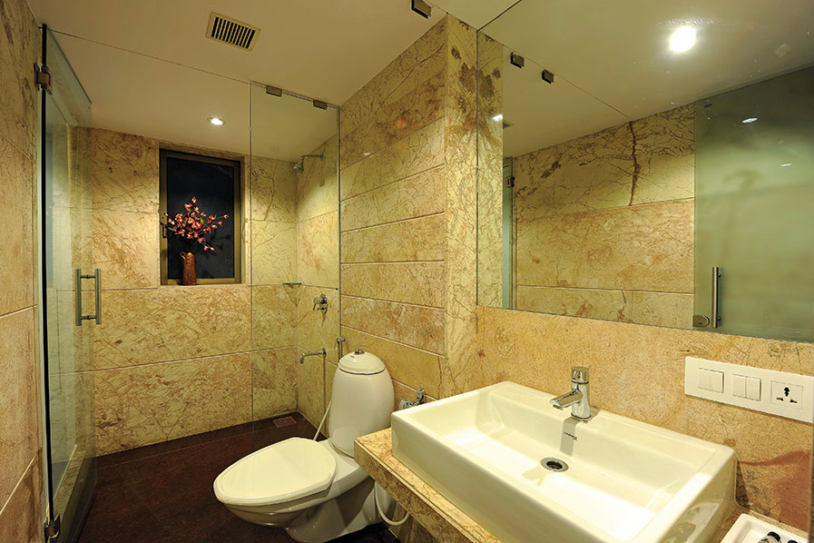
The design fraternity is of the opinion that the judicious use of colours can help a great deal, as they play a big role in the show of space, be it in the washroom or elsewhere. While the obvious choice is using plain white to make the space seem larger, another option is using one light shade of colour throughout the washroom.
“Lighter colours should be used, and dark colours should be minimised. Small parts of the wall can be dark-coloured. So you have a focal point, and the rest of the room is enlarged,” says Zaveri.
Light-coloured walls reflect more light, giving the space a feeling of openness, and enhancing the effect created by natural light. On the other hand dark colours tend to absorb light, giving the space a cramped feel.
Colour uniformity
Keeping an even tone right through the space, that is everything in the same tone and colour helps to make a small washroom look bigger.
Blending the tile colour with that of the wall quite literally, doubles the visual space in a small washroom. This, of course, makes combining dark tiles with light-coloured walls a big ‘no’, as the space will be chopped visually. A splash of colour can be added with an accessory, like a cabinet or a light fixture.
This concept of colour synchronisation extends to all spaces in the washroom. Painting the ceiling the colour of the walls, particularly if it is angled or has some oddly shaped protrusions, is believed to help add those much-needed visual inches.

Kalhan Mattoo
Founder, OOK
“If possible, it’s good to have a window open into something green beyond the washroom. It pushes forward the perceptual edge. Also, consider including skylight, glass for partitions and mirrors larger than functionally required.”
Talking about transitions
A unifying colour also reduces the number of transitions and planes intersecting at a point, thus creating a cleaner, more expansive space.
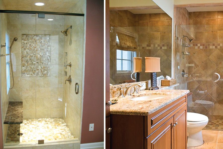
This also applies to the material used. Using the same material, say tiles, across one area to the next without starting or ending it, makes the space appear expansive. As in when the same tiles run all the way around the washroom, the same flooring runs into the shower, or when the tiles from the shower also runs behind the tub, making the background singular.
Tile techniques
Apart from playing with colours, there are other methods to make that tiny washroom look slightly bigger, one of which is to take the tiling in the shower up to the ceiling. This lengthens the line of vision and lifts the space, making the room look bigger.
This minute detail is overlooked on occasions like when the tiles stop just a foot below the ceiling, and then the edges are trimmed out. This is considered a huge design flaw, as along with being visually less appealing, gives a box-like appearance to the bathroom.
The other benefit of having tile so far up the ceiling is that it makes it much easier to clean. Moist air rises, of course, and the painted part above your shower can stay damp if it doesn’t get wiped down often.

Parul Zaveri
Partner, Abhikram
“Mirrors are obviously one choice to make the space look larger. You can have one wall covered with a large mirror or you can put large mirrors at angles as these can create illusions. The third way is by putting smaller mirrors in the right places.”
Clear glass in the shower
Patterned shower curtains may be easy on the eye but they cordon off an entire section of the washroom, making it look even smaller, while textured glass can make a space feel like it has an extra wall or a visual barrier within the room.
Clear glass in the shower allows a clear vision of the entire room, with no visual barriers breaking or sectioning the view. Slightly opaque or etched glass can take care of privacy issues, if at all, though clear glass always remains the first choice.
The mirror effect
Mirrors are essential to any washroom, and if used effectively, can be a great asset to the design of the space.
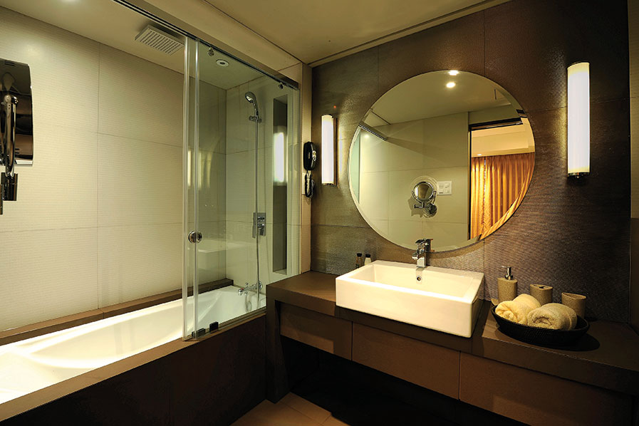
Zaveri says, “Mirrors are obviously one choice to make the space look larger. You can have one wall covered with a large mirror or you can put large mirrors at angles as these can create illusions. The third way is by putting smaller mirrors in the right places. Here, the placement depends on the layout of the washroom. These mirrors keep reflecting different spaces.”
Mirrors reflect both natural and artificial light and illuminate dark, dingy corners. Mirrors trick perspective and nothing is more effective in imparting a majestic feel to the washroom than a mirror that sweeps from the floor to the ceiling. Another effective measure to make the space grow is installing lighting on top of a large mirror, as this will double the impact.

Not just the size, but strategic placement also plays a big role in the effective use of mirrors. As mirrors are only as good as what they reflect, a window that reflects the outdoors is the perfect spot to place a mirror. Similarly, placing mirrors across from a window within the washroom will impart the effect of having two windows in the same space. Mirrored cabinet doors also make spaces feel larger. Ideas like these can be used to enhance the space visually.
However, the use of mirrors comes with certain ‘don’ts’. For one, mirror frames spoil the effect and should be avoided. Double mirrors over side-by-side sinks are another ‘must-not’ as they chop up the space.
Recess cabinetry
Cabinets should be recessed into the wall, not protruding out into the space. Burying cabinetry into the wall will give those much-needed extra inches of space.
Though the options used may eventually depend on factors like time and budget constraints, they open up a wide array of possibilities to expand a small washroom visually.
Tags: Compact Bathroom, Compact Luxury, Kalhan Mattoo, Parul Zaveri, Small Bathroom Design


