Defying Dimensions
The design of this washroom in Mumbai reflects the fact that space constraints need not be a hindrance to creativity, reports Arti B Rau.
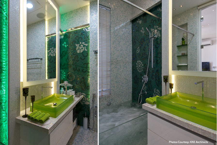
The one feature that stands out in the 50-odd square foot washroom designed by Neemesh Shah in an apartment in Mumbai is the ethereal feel of the space, made possible with the use of transparent and translucent material– be it coloured or plain glass. These not only enhance the aesthetics of the washroom but also make it look so much bigger than it actually is.
Neemesh Shah, Principal Architect, KNS Architects says, “Since the washroom space is already narrow, we didn’t want it to look even smaller. Hence, a glass division gives the illusion of space in a small washroom by allowing you to see from one end of the room to the other. It enhances the visual depth of the space.”
“The essence was to provide a functional space which appears larger than the actual. It’s designed in a way for the user to relax than just use it for necessities,” he adds.
Go green
The principal colour prevalent in the washroom is green. “We’ve chosen green as it happens to be the user’s favourite colour. We’ve offset the green with white as a contrast for the floral mosaic pattern to stand out,” says Shah.
This can be seen in the use of green glass for the wash basin, lending a translucent appearance to it. Green hand towels help in adding splashes of colour to the space. Adjoining the wash basin, an accent or feature wall, wherein a dark green backdrop showcases a beautiful floral design, stands out as probably one of the most striking features of the washroom. The wall with the shower has a similar design, with sleek shower fittings attached to it.
Visual contrast
These two stand out as strikingly different in contrast with the other walls of the washroom, which are peppered with tiny square-shaped light-coloured tiles.
The difference in tiling of the shower wall vis-à-vis the others is explained by Shah. “The colour palette chosen for the wall with the shower was white mother-of-pearl with green mosaic used as highlighter for the space. The contrast gives this bath a fresh personality,” he says.
“The space in a washroom is often very limited hence its challenge which in turn makes it exciting to design it,” he adds.

Neemesh Shah
Principal Architect,
KNS Architects
“Increasingly smaller living spaces in urban areas are leading to varied innovations in washroom design. This washroom is an amalgamation of the judicious use of limited space and great design. The essence was to provide a functional space which appears larger than the actual.”
A clear example of this can be seen in the design of this washroom, as the design team managed to face the shortcomings of limited space to adhere to the client’s brief. “The client desired a bathtub, which in normal circumstances wasn’t possible to accommodate in the given space as the bathtubs come in standard sizes. In turn we custom designed the shower space into a bathtub cum shower space with a clear glass division which enhances the visual depth of the space,” says Shah.
The design of this washroom allows a lot of light to permeate into it, be it by the use of Venetian blinds or other modes. “A play of light, that is, natural and artificial has a significant role to play to enhance the look of the space,” he adds.
About Storage
Given the limited space, certain aspects like storage had to be dealt with dexterity. “The washroom is for a young girl in her teens who has a bedroom to herself. While the storage space is taken care of in the bedroom itself, a niche has been created to accommodate the bath essentials. Since the space in hand was compact we didn’t want to crowd it with storage spaces as it would make the washroom look congested. For a clean and decluttered look, we opted for minimal accessories and furniture in the washroom,” says Shah.
Explaining the role played by washrooms in giving vent to the design sensibilities of the architectural fraternity today, Shah says, “It is an inverse relationship. Reality prices have skyrocketed, the size of the apartments is reducing. However, the requirements of a family remain the same. The clients want to utilise every square inch they’ve paid for. The washroom is turning out to be a major space for giving vent to design sensibilities in today’s time for its ‘compact nature’. Today, the clients want more out of each space. Hence, to meet all their requirements and aspirations can be challenging.”
Increasingly smaller living spaces in urban areas are leading to varied innovations in washroom design. This washroom is an amalgamation of the judicious use of limited space and great design.


