Unlocking the Design Potential of
Powder Rooms
Of all the spaces in a house, the powder room stands out as a tiny jewel, offering an opportunity to showcase creativity and elegance, writes Mrinmoy Dey
Over the years, the usually small and diminutive powder rooms have transformed to become a space to showcase design statements. Despite their compact size, powder rooms possess the potential to leave a lasting impression on guests. And, thus has become an integral part of designing the interiors of a house.
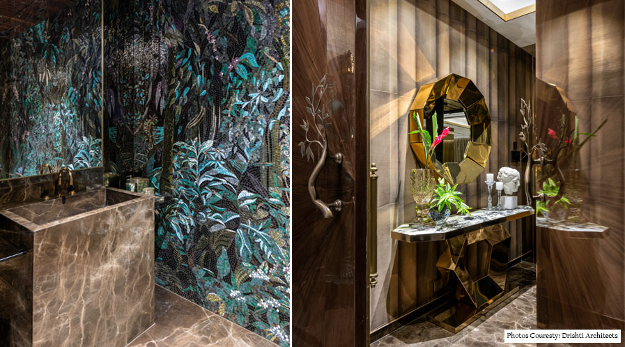
Powder rooms often offer the perfect opportunity to be bold and experiment with the design – be it in terms of materials, theme or an eye-catching colour or wallpaper. Power rooms can be transformed into a stunning oasis that reflects the homeowner’s style and enhances the overall ambience of the house.
Focusing on a theme
Powder rooms offer an ideal canvas for experimenting with bold colours and unique patterns. Dark colours and large-size patterns which might be too much in a regular washroom can work beautifully in a powder room. Designers often experiment with vibrant hues, rich textures, or intricate wallpaper designs to transform this compact space into a visual delight.
“A powder bathroom is one place in the house that gets maximum attention from guests and since it’s a dry and semi-dry zone therefore, it’s completely ok to go a little overboard in colours, textures and materials, as long as it’s in flow with the overall design statement of the house,” shares Mihir Kotak, Principal Architect, 4th Dimension.
The powder room is essentially used by the guests visiting the house. It is therefore generally approached with a design concept that can be experimental in nature and one that creates an impactful impression for the end user. “The theme or colour palette may break away from the design language of the entire house by using striking elements and materials that enhance the vibrancy of the space and create a ‘Wow Factor’,” opines Shresht Kashyap, Director, KNS Architects.
Deesha Nulkar, Senior Interior Design Consultant, Centre for Design Excellence agrees, “Usually the theme of the powder room is contrasting with the overall theme of the house. It’s meant to be a space that you dramatize and create a design statement.”
The design approach can be looked from two ways. “First, we choose premium, designer or artist edition fixtures that are the talking point of the powder room and then in accordance with the selection we chose the material language, the colour palette and the lighting concepts. For example, in a recent 30,000 sq ft premium residence we designed, we chose an artistic Moroccan washbasin and vanity counter which was beautifully complemented with a subtle grey Italian marble,” shares Nulkar.
She further adds, “Alternatively, we design a theme and then the fixtures are chosen in accordance with the theme. For example in a recently completed premium residence, we designed a Victorian-style powder room, which was beautifully complemented by a French gold embellished washbasin and a carved gold mirror and to add to the glamour we added a delicate glass pendant light as an accent feature.”
Jewel tones like emerald green, sapphire blue, or deep amethyst can infuse an air of luxury, while softer pastel shades lend an elegant and serene vibe. Designers also use patterned tiles or statement wallpapers to create a focal point that captivates anyone who enters.

Deesha Nulkar
Senior Interior Design Consultant, Centre for Design Excellence
“Powder rooms are the best spaces to bring in a statement washbasin like a standing stone monolith washbasin with a ceiling mounted faucet, or a countertop with an intricately designed glass bowl.”
Walls, floor and ceiling: Unify or contrast
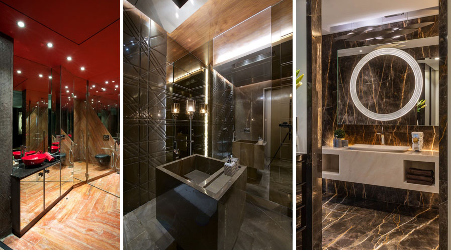
Walls, floor and ceiling are the three main components that bind the space. “They may be treated such that they blend into one another to depict a unified style statement. Or, they may be treated with contrasting materials and colours whilst maintaining a constant synergy in the space. The end goal would be to create an impression of being a well-composed dynamic space,” opines Kashyap.
He further adds, “For example, the use of a bold red colour for the ceiling and black sanitary fixtures is perfectly balanced with a muted hue of the wooden flooring, composing an energetic yet warm space in a powder room we designed as part of a residential apartment project in Mumbai.”
In another project, for a bungalow in Delhi, the brief for KNS Architects was to design a luxurious powder room. “The rich dark brown marble seamlessly flows from the flooring to the walls giving a perception of an expansive space. The layering of fixtures, accessories and lights in accent shades, interacts beautifully with the homogenous base of the space,” explains Kashyap.
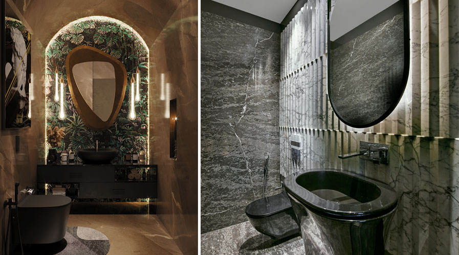
According to Nulkar, usually, the idea is to design the space such that one aspect dominates or brings out a feature and the others are subtle or understated. “For example, if we were to dado the powder room in marble to up to just 4 ft high, then we have the walls to play with by using beautiful 3d wallpaper – be it tropical, botanical or even geometric prints or a textured paint that brings in pattern and drama.”
She further adds, “Now, the ceiling in this scenario can be subtle with accent lights or focus lights to gently wash the walls and bring in that softness. The floor can either be in a solid vitrified tile in colour that is picked up from the colours in the wallpaper or it can be classic beige or grey marble that does not overpower yet looks plush and elegant.”
Kotak gives an example of a powder bathroom designed by him with a nature-inspired statement mirror wall and subtle Armani beige marble for the floor and walls. “The bold mirror wall in classic glass mosaic anchors the whole space and serves as a background for all other elements. Ceramic and sanitaryware are not too loud yet complimenting in black matt finish.”

Mihir Kotak
Principal Architect,
4th Dimension
“A powder bathroom is one place in the house that gets maximum attention from guests and since it’s a dry and semi-dry zone, therefore, it’s completely ok to go a little overboard in colours, textures and materials, as long as it’s in flow with the overall design statement of the house.”
Sink & Vanity: Statement fixtures
What better way to make a statement than showcasing eye-catching faucets, designer sinks, and luxurious countertops? Often, the washbasin area which includes the sink, vanity and mirror is the centre of attraction in a powder room.
Nulkar adds, “Powder rooms are the best spaces to bring in a statement washbasin like a standing stone monolith washbasin with a ceiling mounted faucet, or a countertop with an intricately designed glass bowl.”
The selection of a sink and vanity is generally very subjective as per the requirements of the end user. “A customized stone and basin that blends with the overall design does create an edge above. There is always an attempt to make the sink/vanity a striking element of design within the space rather than an eyesore,” opines Kashyap.
According to Kotak, while customised basins work beautifully in powder rooms, it completely depends on the theme of the house. “We can definitely pick up unique basins from brands like Gessi, Sourze, Antoniolupi etc. Most of the time, we end up customising the basins in stone to go with the theme of the entire house.”

Shresht Kashyap
Director, KNS Architects
“There is always a warm and welcoming vibe visualised for powder rooms and the lighting is designed accordingly. Yet, there is always a plan to balance the functionality of the space along with the ambience. Task lighting is normally designed above the mirror and basin counter in a decorative disguise.”
Playing with lighting and mirror
Ample lighting is crucial in powder rooms, as it enhances the sense of space and contributes to a welcoming atmosphere. A healthy mix of natural and strategically placed artificial light can enhance the user experience. A well-placed window or skylight can bathe the room in natural light during the day, while layered lighting fixtures, such as sconces or pendant lights, can provide a warm and inviting ambience at night.
Kashyap adds, “The powder room generally looks good when it is dimly lit. There is always a warm and welcoming vibe visualised for the space and the lighting is designed accordingly. Yet there is always a plan to balance the functionality of the space along with the ambience. Task lighting is normally designed above the mirror and basin counter in a decorative disguise.”
“A wash of light on the vanity counter is a must as that is the integral and most used part of the space. Apart from that I would recommend washing the wall with either a backlit mirror or a wall washer to bring in a warm and cosy feel and a pendent or wall scone to add to the overall decor and glamour,” shares Nulkar.
Often, mirrors in the powder rooms complement and enhance the lighting. In fact, mirrors are indispensable in powder rooms, as they reflect light, create an illusion of a larger space, and add a touch of glamour. Designers often go for an oversized mirror or a decorative mirror with an intricate frame to elevate the overall design.
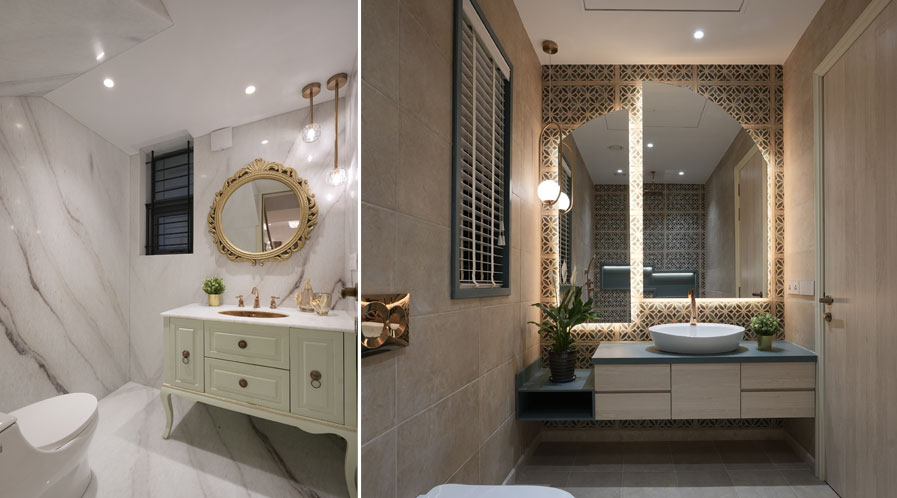
According to Kotak, the lighting in the powder bathroom should be a blend of the task as well as ambient lighting. “In simple words, it should be both functional as well as beautiful. From dramatic chandeliers to hanging pendants for the extra glamour quotient along with the statement sconces on either side of the mirror can be explored.”
Harnessing wellness and going glamorous
The concept of wellness in a powder room varies from that of a full-fledged bathroom. Since it’s a dry or semi-dry zone, water-centric wellness measures are mostly missing here. Instead, it focuses on a biophilic design approach by establishing a connect with nature through lighting, materials, accessories and the overall design of the space.
Kashyap concurs, “The theme of wellness and nature is a constant in most of the spaces designed. It’s a concept that imparts vibrancy and freshness to any space. The use of natural or rustic materials, element of greens, and the play of natural daylight can also be interpreted to achieve a jewel box concept or a regal look for the space.”
However, it doesn’t need to be mutually exclusive. Both concepts can even be intertwined in the design of the powder room. “You can also create the magic of nature with some exclusive materials in a jewel box type concept,” asserts Kotak.
Tags: 4th Dimension, Bathroom Design, Centre for Design Excellence, KNS Architects, Powder room
