Less Will Always Be More
The idea of minimalism is evergreen but its application can be maximised infinitely.
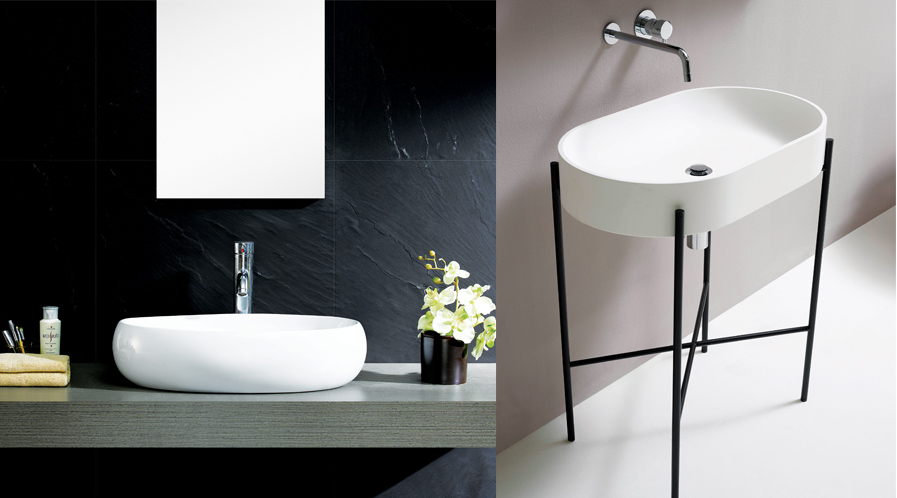
Modern washroom design is defined by its appearance and it is marked by usually straight lines, a minimalist sense and clean counter spaces. Decorative motifs are totally out and geometric shapes are the repeated theme. The nomenclature ‘modern’ is often used loosely in conjunction with ‘contemporary’ when in fact, there is a clear distinction between both. Both terms are used in the context of design themes that are current at any moment of time. In the case of washrooms, the modern design theme is starkly different when compared to contemporary design. Some even state that the term modern washroom design is actually a misnomer.
Coming from the followers of the Bauhaus School of Design in the earlier part of the last century, this philosophy of form over function was extremely popular till it morphed into the culture of kitsch in the late 60s and 70s. From the ornate and wooden ambience of old style washrooms in the west to the stone and splashy styles prevalent here, the minimalist style was a response to the profuse accent on decoration and embellishment that passed off as design.
A well-organised space with minimal décor clutter and clever storage solutions is the essential element for anything to be bracketed under the category of modern. Clean geometrical shapes and contours of counter-tops, textures of tiles, and their colours – all developed as bland but sharp elements of this design form. Materials used in wash areas played a significant role in acceptability of design forms. For this stainless steel, silver, bronze, brass, copper and even glass worked well with modern bathroom faucets, fixtures and features. The trend is persistent and shows no trend of undergoing any major shift.
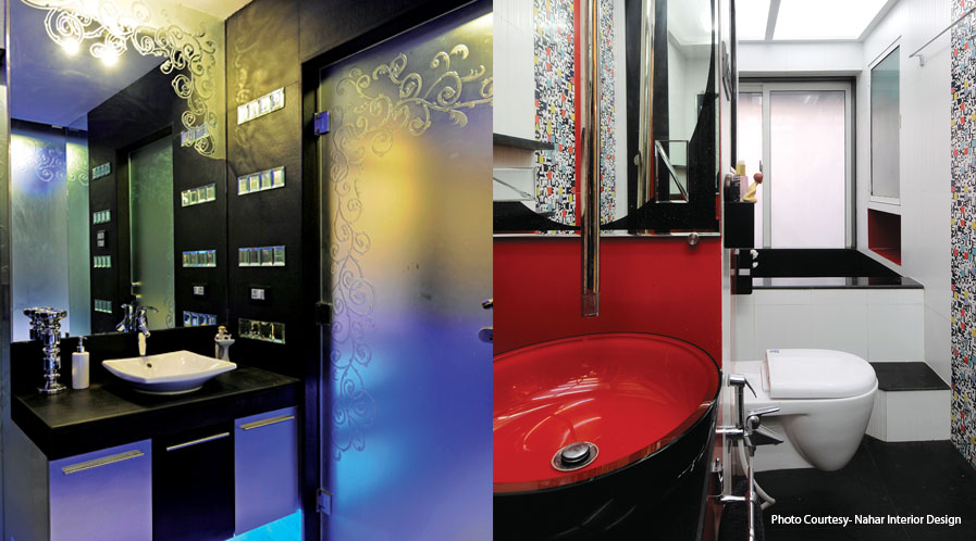
Accenting with bright and bold colours is also a feature that is often used to underline statements with greys, browns and even deeper colours reflecting industrial overtones. While white remained favourite over most of the modern era ( it still holds a central place) dabs of bright colour in bright hues are often used to contrast with the neutral tones. The basic design sensibility of following the sanity of choice on the colour wheel ensures the colours line up correctly on the colour wheel.
Less is More
Minimalistic is now quite an old term. The idea of minimalism might be stressed upon quite often but sheer absence of clutter is not its objective in the real sense. That is perhaps just a basic requisite but the intelligence behind minimalism is a complicated affair. It does create a positive space and opportunity to create a truly sustainable design. The idea is to titrate the area geometry in a way that the washroom functions well, while still being grand and comfortable.
Clean and straight visual outlook and a certain absence of architectural ‘noise’ define the perfectly minimalist washroom. Simplicity, however, doesn’t mean boring. There is a world of difference between minimalist and dull. Most modern design (one may call it contemporary as well) is totally mindful of this fact .This is the leitmotif of washroom creation and renovation today.
The holding back or restraint in design today is essentially to prevent the return of loud and gaudy accents in form and colour. The idea is to keep away from design clutter which is important since there is a huge scope of adding various elements even in minimalist palette. Over the years experts and philosophers of design have underlined the importance of simplicity and restraint. The minimalist style and the philosophy that inspired the movement were based on creating functional space and leaving the rest free to create maximum impact. The important feature for minimalist washrooms is the spa-style design and makeovers. A preponderance of open spaces, subtle and muted, strategically placed design elements always highlight the thrust of understated luxury.
While minimalism works well for exteriors and is great for all interior spaces, the impact on washrooms is perhaps the strongest. Minimalistic styling with focus on functionality and symmetrical lines are one of the essential features of contemporary washrooms. By resorting to one colour and extending its appeal by incorporating its various shades, designers express the virtues of understatement with a hint of more visible dialogue in design.

Other Elements For Enhancement
It is for this reason that glass and judicious use of mirrors play a vital role in modern minimalism styles. In times when space is at a premium, glass and mirrors are perfect to create more space when there is little to go by. A subtle way to add drama and colour to minimal design is to incorporate wood and natural stone in the design, by adding greens by way of plants, the colour quotient is maintained without appearing to be intrusive or loud.
Light design is also a vital part of the minimalist philosophy. Minimalism has a restricted colour palette, limited to black, white, grey and possibly one feature colour. Designers do not rely merely on colour to enhance the character of the bath space. They essentially must rely on light and not just the lights that can be switched on and off. Playing with light means effectively designing the washrooms by simply reflecting natural or artificial light. The layers of light, so popular in living rooms, creates a similar and perfect illusion of space in smaller areas like washrooms. It also lends drama which can be severely cramped for expression within limited space.
Long Standing Idea
The minimalist concept is not new to Asia nor is it a totally western concept. It is just that washroom design in ‘hammam’concept was a different context in history of Indian sensibility. Water was the theme of the washroom especially in the middle ages when pipes were not such a major influence. The philosophy was born from traditional Japanese architecture and interior design. Minimalism has built the foundation for clutter-free and graceful designs,
There is a clear logic in sleek, clean lines since it works pertly in both big and small washrooms. ‘Less is more’ doesn’t mean empty undecorated space. Minimalist interiors are calculated design spaces, but clean and clutter free at the same time. Following minimalist design philosophy, elegant and intriguing interiors can be created.
The max of minimalism
There are certain things that minimalism is definitely not. For example, spaces have to be serene and uncluttered, but not cold and sterile. Materials are often sufficient to add elements of design by themselves as wood and stone combinations in many washroom vanities need no embellishment as they are extremely tactile surfaces.
Minimalism is design chic, but the washroom that is well designed must stand out as a statement to be noticed. That is the reason why it always does include an abstract element. In keeping with minimalist principle, there is always a need to ensure the abstraction serves a purpose in addition to its artistic function.
Minimalist design is calculated and precise. Every element of the washroom must complement other elements within the space. It’s somewhat easy to select the tonal theme, the tiles; even the lighting but selecting the wrong hardware can wreck the effect completely. Thus the function of complementing is also sought to be fulfilled by washroom accessories and fixtures.
Washroom majors anticipated the trend and discovered these decades back and put their design teams on the job. The wash basins, faucets, tubs and showers while being in the mode of minimalism themselves, are created with keen attention to design to fulfill the need for quiet drama.
According to psychologists, those who prefer to be surrounded by minimalist designed spaces are much more resistant to stress and other negative emotions. If the washroom is the essential me-time forth user, this design style is not only just another style but a philosophy that is for keeps.
Tags: Counter-tops, decorative motifs, Geometrical Shapes, Japanese architecture, Minimalistic Washroom, Modern Washroom, nomenclature


