The Shower Cubicle
A hint of colour transforms an essentially plain glass washroom product.
The Indian washroom moved miles from the traditional ‘Hauz’ style, the bucket and mug plebeian settings to luxury and stylish interpretations. This happened majorly in the last quarter of the last century. Before that in usual middle-class washrooms, the clear-cut delineation of the wet zone was oddly not considered too much of a necessity. Often that was also compelled by space constraints, especially in bigger cities. However, even the most basic design clearly demanded some sort of design to prevent splashing and wetness that besmirch any washroom space.
We remember that the early versions of wet and dry areas demarcation meant just building a half wall between the showering area and the rest of the bathroom. In fact, at times investing in a walled shower cubicle was considered a needless intrusion of precious space. This brought the rather economical shorthand in the form of shower curtains which were much cheaper, though frankly, they didn’t achieve much.
One can easily conclude this was an ‘ancient’, even ‘puerile’ way of doing things but in times when most things were governed by finance, the washroom appeared last on the priority list.
Washrooms to the fore
Thankfully, a total washroom revolution hit the Indian market in the early nineties. Of course, the scene was full of glitzy baths and stylish washrooms in uppity homes, but it was only in the 90s that the rise of the middle class and a surge in aspirations knocked down the lines between expensive and stylish.
The first brush of the middle classes with luxury was the bathtub. Every home that could squeeze it in started installing bathtubs, even fabricating them with fly-by-night creators. The sheer grotesqueness of the ill-considered imitations made it short-lived. Thankfully, at that time designers gained their rightful place in the nation’s average’s mind.
It goes to the credit of washroom designers’ acceptable nudgings that the shower cubicle made its grand appearance in Indian washrooms.
Shower enclosures: an important safety feature
The shower cubicle helped separate the washroom into distinct dry and wet areas thereby preventing slips and falls. They kept the water restricted inside the cubicle and reduced the time and effort of cleaning that space as well.
The dilemma of designing an enclosure that blends with the overall space was left to the new-age designers of that era. They ensured that if it was a full-length partition wall from floor to ceiling, the washroom did not look cramped and that both zones still received plenty of natural light.
In case the layout did not lend itself to a full-length wall, a half-wall, or constructing the top half out of glass, became the simple solution to enable natural light to flow through the space. The thing was, most such experiments of permutations and combinations were happening in the aspirational class in the cities, especially the metros. Space was always at a premium there and washrooms were small. These factors necessitated the enclosed shower cubicle with shower doors to create a partition. Neat edges and clear frameless glass ensured the presence of lightness, vision and a feeling of space that is bright and ample as well. Soon the shower cubicle made its mark in Tier 2 towns as well.
New Dimensional Changes
Positioning the wet zone furthest away from the washroom door to limit water dripping around, right position and access of towel rails, and optimum height and angle of faucets and showers followed next. The cubicle mostly retained its rather plain look for a long time.
While all this was happening, the washroom majors stepped in majestically and brought a definitive sense to the design with a corporate-style finesse.
The concept of colour in a plain glass and minimalist shower cubicle was initially a study in self-contradiction. The usual hue on the steel edges was a natural steel or at best a white coating. The desire to create a clear vision steadily tried to do away with as many hinges as possible.
With the focus on creating a visual idea of objectivity anyway, the hinges were a bit pronounced and a sizeable handle on the inside and a handle that served as a towel rod on the outside of the cubicle door were placed for effect.
Shower enclosures soon become increasingly customisable spaces, for different configurations that suit the space – domestic and wellness areas. In hotels, the shower cubicle soon became an essential element.
New designs and colour
In a furnishing project, the bathroom is considered not only from the viewpoint of functionality and efficiency but above all harmony. Whichever solution one may choose, it is possible to create refined combinations or surprising contrasts that change the atmosphere of the washroom space. The shower enclosure can be combined with the taps and fittings, the colour of the sink or other accessories. At a recent expo, the Italian firm Duka revealed the same liberty in designing the bathroom space.
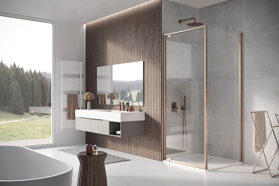
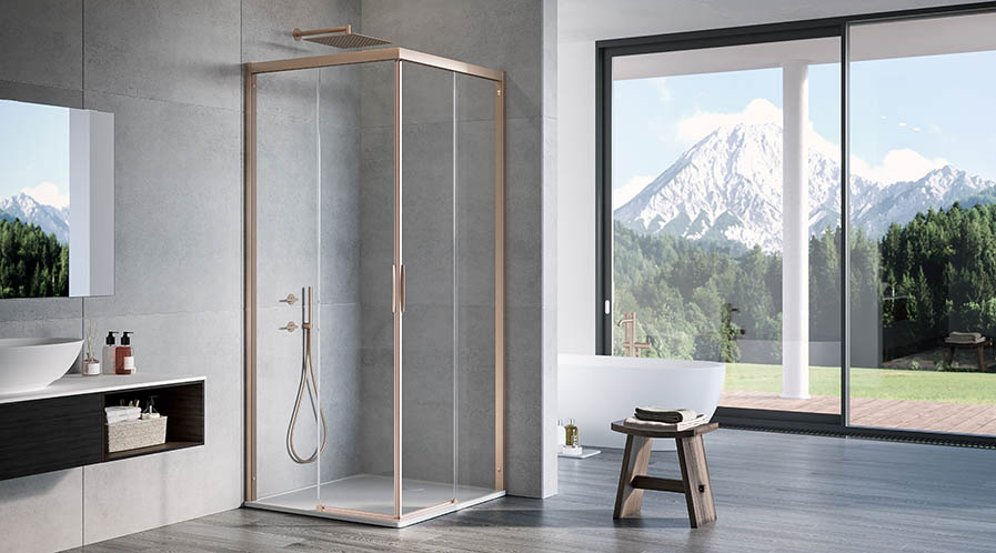
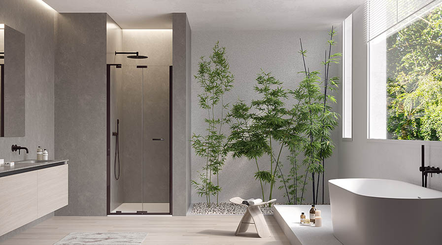
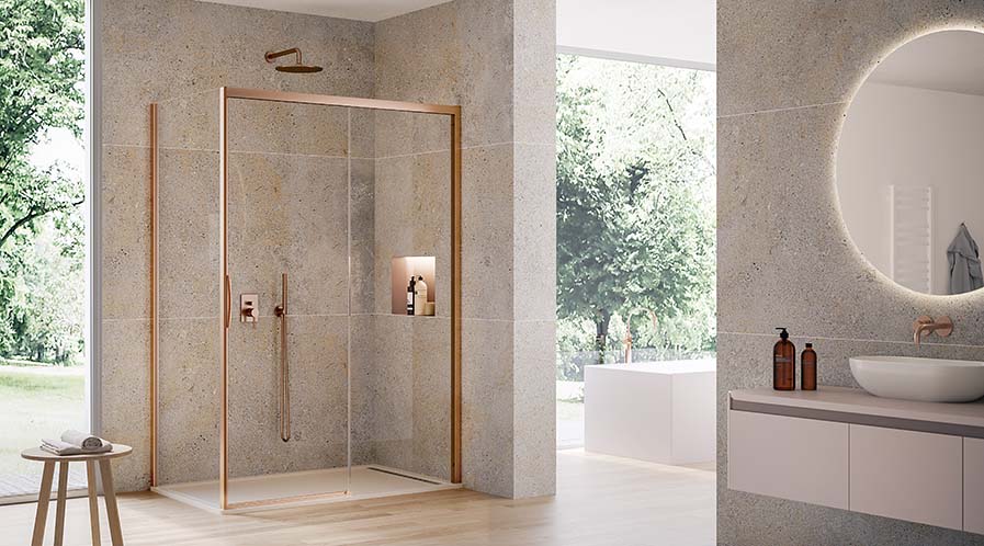
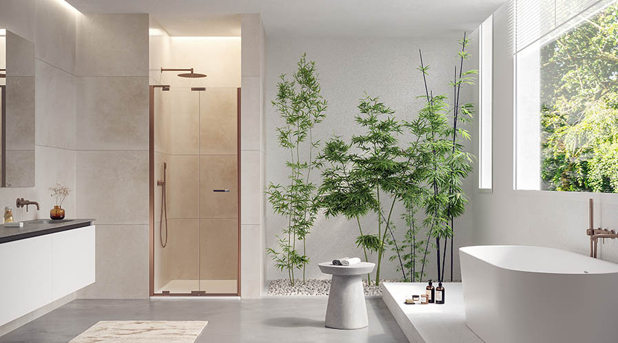
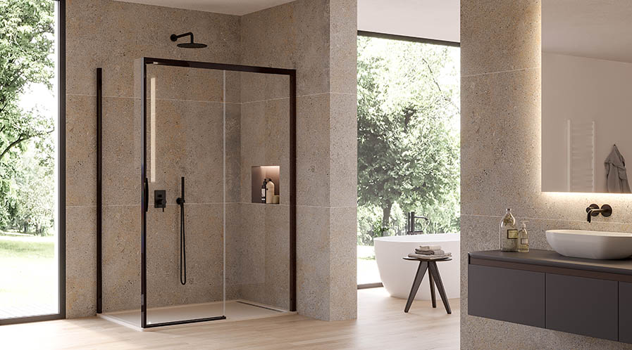
The shower cubicles by Duka were presented with the see solutions from a new series to bring colour into the washrooms. These new shower enclosures become elements with a contemporary appeal as the models of natura 4000 and libero 4000 of the Colour up Your Life series reinterpret the concept of well-being as comfort and visual gratification.
The design and colour used in this create unique and emotional environments by turning profiles, handles, hinges and other structural components into elegant decorative details. This comes about with brilliant metal finishes of copper pearl, brass pearl and black pearl.
The structural elements and metal components are fixed to the glass by the Duka UV adhesive technology that eliminates the need for screws and ensures high glass resistance.
Shower cubicles gain market traction
Today, the smooth inner surface, without any raised components or obstacles, facilitates care and cleaning of the shower enclosure, enhancing its aesthetics. The inclusion of other functional features, such as the offset pivot point of revolving and bi-folding door solutions, optimises the shower space.
In India, the rise in building refurbishment activities is one of the primary growth factors for the shower cubicle market. A recent report says that the rise in the usage of technology continues to be one of the key trends gaining traction in the shower cubicle market to which colours will add that extra chutzpah.
Tags: Bathroom Fittings, Bathroom Products, Bathroom Technology, Bathroom Trends, Shower Cubicle
