
The Truth in Black & White
In a world of myriad hues, the contrast of black and white has stood firm in time, writes Anurag Yadav.
While colours from across the spectrum have a field day by way of options in washroom interiors, the extent of experimentation is only limited by clients’ choices and designers’ boldness. From stark white, which soon went confined to the hospital sector, the entry of pastels and patterns heralded emerging trends in the early days. Today, the leitmotif is of repose, even rest and relaxation in the washroom ambience. The presence of a strong contrast like black and white is quite rare, especially when colours define moods in a much more defined manner.
The psychology behind it all
Understanding colour is the root of all expressions and moods that are generated by any colour palette. All individual responses to colour are through filters that can be very individual.The associations that colours generate are largely related to social mores and cultural concerns. Black associates with sombreness, power and white relates to purity, openness and clarity. In interior design, the fact is that black closes spaces and white opens them.
Designers understand the conversation black and white has within space.The contrasts do not compete but on the contrary, they create completion.The visual balance of black and white, with or without an accent colour makes the visual magic pop into the vision strongly.
Colour experts underline the philosophy that this combination opens the one experiencing the space to possibilities that exist in their mind. It is in this background that any essential other colour stands out in direct relief – whether it’s a flower vase or even a bath towel or a rack.
Classic yet contemporary
A black and white selection is a contemporary and classic style option. However, there are sufficient ways to underline the tonal duality of the two shades of opposites.
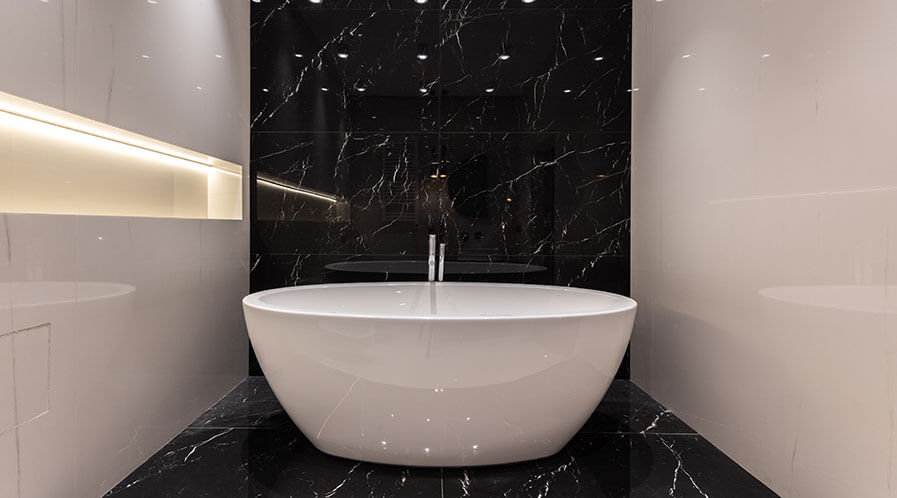
The statement made by a black and white combination can be equally perfect and stark for light reasons. Since black absorbs, while white reflects – this combination is such a great choice for creating a real impact.
Designers aver that the mix of black and white adds a different look to any functional area. In a washroom, clear angles and stark lines tend to lend a clean structure to an area that exudes a no-frills approach. This is especially effective for the development of the me-time that is such an integral part of the washroom bathing experience today.
“The statement made by a black and white combination can be equally perfect and stark. Since black absorbs, while white reflects – this combination is such a great choice for creating a real impact.”
The sure-fire way to accord a luxurious impact is the monochrome washroom. However, the urges of modern day’s sensitivity often borrow from the humungous activity that is a part of life in the city. The monochrome luxury is, therefore, more laid back in its essence. The abruptness of the black and white contrast vibes well with classic fixtures in bright white and tiles that announce a dark feature. Black and white is bold contrast any day and it is enough to make a statement without creating a cacophony of colours.
The fears remain that a combo of black and white is open to a staid element creeping into the space over some time. This doubt, according to the designers who vouch for its longevity, is met by the options of freedom that creativity offers to the designer to be as fun, different, and effusive with pattern and texture. In fact, experts are firm in the belief that this combination is not a fad or a temporary return to sepia-tinted dreams of a black and white past.
It has demonstrated its staying power over the years. The right combination has its set of basic postulates. It is timeless and does not lend itself to the need for change. Reasons are many – the primary one being that it never goes out of style and never turns dated. Colour trends change but the B/W theme persists.
“Experts are firm in the belief that this combination is not a fad or a temporary return to sepia-tinted dreams of a black and white past. It has demonstrated its staying power over the years. It is timeless and does not lend itself to the need for change.”
The graphic simplicity of monochrome packs a punch as it’s bold, exact, and never half-hearted. That it conveniently slips into any budget is its other positive point. For the attitude that resents budget as anathema to luxury, the vista is open to creativity. That is the final test for designing with this timeless colour combination.
The statement made by a black and white combination can be equally perfect and stark for light reasons. Since black absorbs, while white reflects – this combination is such a great choice for creating a real impact. Experts are firm in the belief that this combination is not a fad or a temporary return to sepia-tinted dreams of a black and white past. It has demonstrated its staying power over the years. It is timeless and does not lend itself to the need for change.
Tags: Anurag Yadav, Bathroom Design, Bathroom Interiors, Bathroom Trends, Black and White Washroom, Design Buzz